

S. L. I. D. E.
January 21, 2019
Note : I do not speak for any organizations. All opinions shared are my own.
Like this post? Tweet about it!
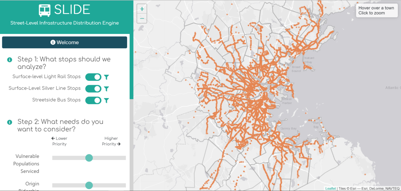
Screenshot of SLIDE's start screen
What is it?
SLIDE stands for Street Level Infrastructure Distribution Engine. SLIDE is a prioritization tool designed to rank bus stops in the MBTA’s network in order of how "deserving" they are of new stop amenities. Stop amenities are things that generally improve a riders experience, like a shelter or a bench. SLIDE allows policymakers to systematically compare all bus stops in the network when emphasis is given to different criteria.
SLIDE is a tool that quickly visualizes where to invest in new bus stop infrastructure based on what the user decides is important. SLIDE allows the user to emphasize the weight of the vulnerability of riders, the amount of people who begin their journeys at a stop, and the amount of people who transfer at a stop.
How does it work?
SLIDE takes whatever subset of stops the user chooses, and how the user weighted vulnerable populations, origin ridership, and transfer ridership, and generates a ranked list using these criteria. SLIDE then displays this on a web map and stores this ranked list in a csv for download.
Why would someone choose a subset of stops?
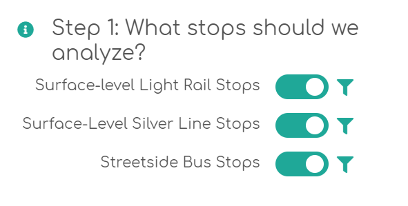
Step 1 allows for general categories to be turned on and off or filtered
Street level infrastructure is typically associated with buses, but buses are not the only mode that can benefit from street level infrastructure. The MBTA has surface level light rail (the Green Line and the Mattapan Trolley) that require riders to wait outdoors. These surface level light rail stops might be considered for new infrastructure due to their high ridership.
The MBTA also has different classes of buses. The MBTA has a Bus Rapid Transit (BRT) line called the Silver Line. Because the Silver Line is considered rapid transit, it already has different stop amenities than typical bus stops. Silver Line riders also expect a shorter wait time, given that the line is BRT. The Silver Line stops might be considered for new infrastructure given their high ridership, as well.
Even within normal bus routes, there are different classifications. Bus routes can either be considered "Key" or "Non-Key". Key bus routes are more popular routes. Because the ridership on these routes is high and consistent, the MBTA will schedule buses frequently along these routes. Non-key bus routes, or infrequent bus routes, are less traveled. Non-key buses are scheduled less often, and the MBTA expects fewer riders along these routes. Because riders interact differently with the different types of bus routes, users might want to consider them separately for analysis.
What are the weights?
The different qualities that the user can weight are origin ridership, transfer ridership, and vulnerable populations. Origin ridership indicates how many people start their journeys at a particular stop. Transfer ridership indicates how many people transfer at a given stop, which is a proxy for estimating how long people are waiting at a given stop.
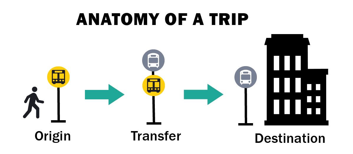
An infographic I designed for SLIDE's info section
Vulnerable populations serviced by a stop is a more complicated metric. To get estimates on this, we looked at where people with senior discounts and TAP discounts are frequently getting on the bus. Because individuals in these groups tend to have mobility impairments that would prevent them from walking to another bus stop nearby with better amenities, these individuals are prioritized.
We also used census data to look at neighborhood demographics around each stop, including the amount of income households earn, the racial demographics, and the amount of households without vehicles in surrounding census tracts. Bus stops with amenities are a neighborhood asset, and when investing in new infrastructure the MBTA has the opportunity to invest in historically underserved communities, like those that are majority of people of color. The MBTA also has an obligation to serve those who are typically transit dependent, low income households and households without vehicles.
Then what?
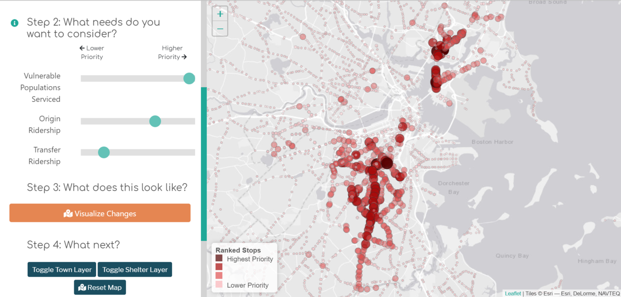
A simple graduated symbol and graduated color map show where the high priority bus stops are located. More data, like the adjusted score for each of the weights, is available in the csv.
The tool is remarkably fast. This allows for stakeholders to play with the data and see how their small decisions dramatically impact where infrastructure gets placed. This tool makes data driven decisions easier, and lets non-technical audiences interact with complex data in a way that is fun and intuitive.
Special thanks to:
- Brittany Meece, project management
- Anna Sangree, data preparation (which is no small feat)
- Anna Gartsman, statistical support, project management
About the Author

Violet loves making maps and satisfying data visualizaitons. Violet also love getting down and dirty with data. See more about her here.
transit leaflet.js turf.js ArcGIS jQuery
Made with ❤ in Hollister, CA
Powered by Gatsby in Oakland, CA