

Bus Crowding: Ridgeline Plot
April 30, 2019
Note : I do not speak for any organizations. All opinions shared are my own.
Like this post? Tweet about it!
Play with the modified visual here
As a fun extension of the work I did for my capstone at the MBTA, I developed this visualization method inspired by Joy Division's iconic Unknown Pleasures album cover.
History of the Design

The inspiration for the Joy Division album cover actually came from a data visualization from the Cambridge Encyclopedia of Astronomy
The iconic album cover was desinged by Peter Saville in 1978 for Joy Divison's ablum "Unknown Pleasures", but the design was originally a data visualization. The band found the image in a page from the Cambridge Encyclopaedia of Astronomy (1977 edition, Scientific American notes) depicting a series of radio frequency periods from the first pulsar discovered. The diagram they say was created by Harold D. Craft, Jr. for his PhD "Radio Observations of the Pulse Profiles and Dispersion Measures of Twelve Pulsars" (September, 1970).
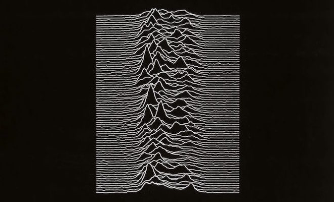
The image from Joy Division's Unknown Sources album cover
The album cover desing is immensely popular. It has been parodied many times, from artists drawing upon the style of the ridgeline plot to create new designs, to word play on either the band's name or the album's title.
Bus Crowding
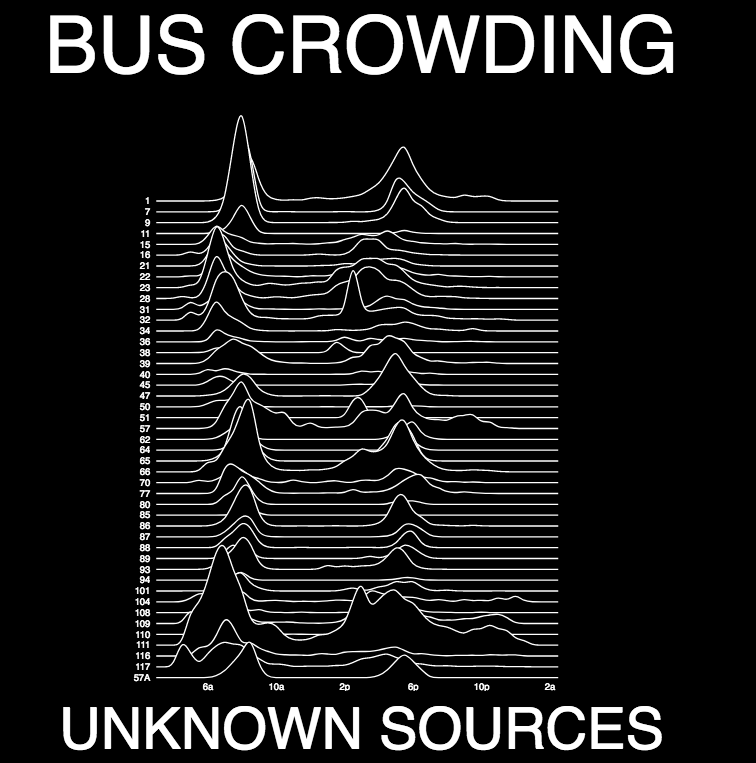
Poster version of the chart
This chart was designed to give a quick method of overview and comparison for crowding along each route at any given time of day. I chose to use a ridgeline plot because a user can quickly assess how the routes compare to each other by looking at their crowding peaks -- which look sort of like peaks on the ridge of a mountain. This style of chart allows for weird routes to stand out, like routes that have peaks at unusual times or peaks that are dispersed over long periods of time.
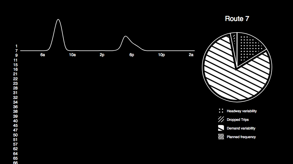
When the user hovers over a specific route, the chart drills down to show a pie chart of the sources of crowding for this route
When the user hovers over a route, the other routes fade to black, and a pie chart showing the sources of crowding for that route appears. This allows the user to take a closer look at a given route without the distraction of the other routes near it.
About the Author

Violet loves making maps and satisfying data visualizaitons. Violet also love getting down and dirty with data. See more about her here.
D3.js Joy Division Textures.js data visualization
Made with ❤ in Hollister, CA
Powered by Gatsby in Oakland, CA